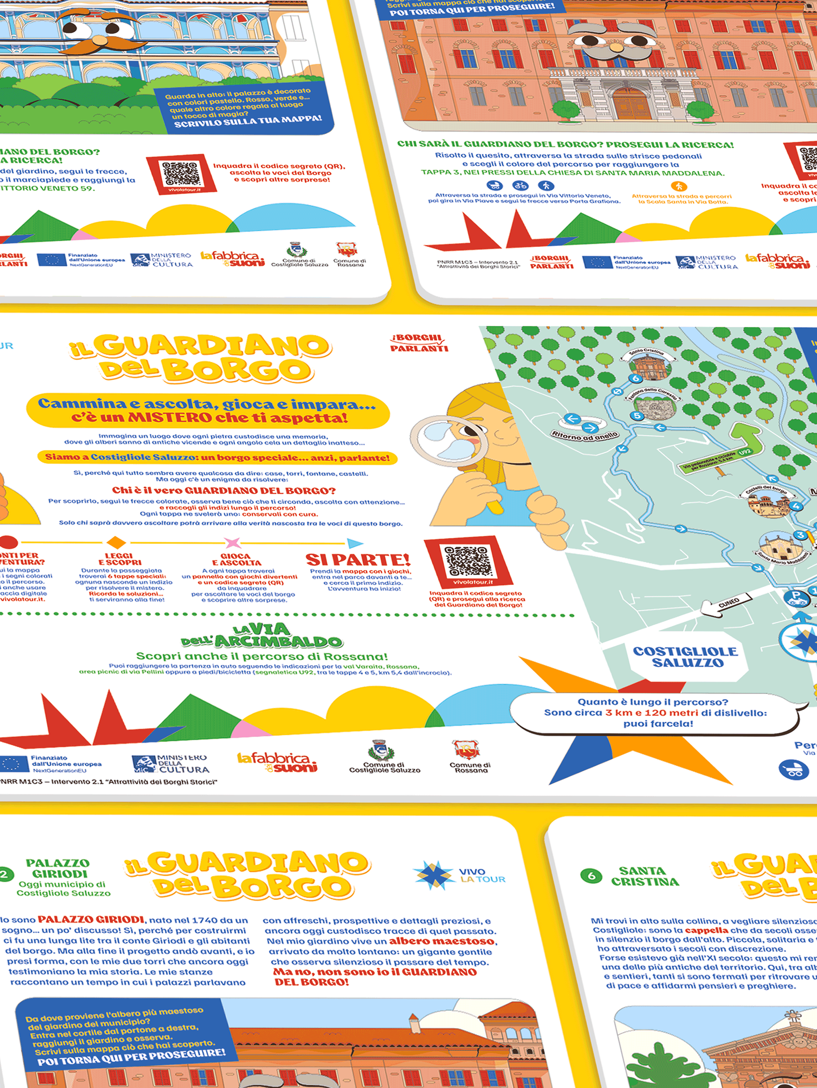
Two case studies about illustrating for different brands with a shared connection to their territory.
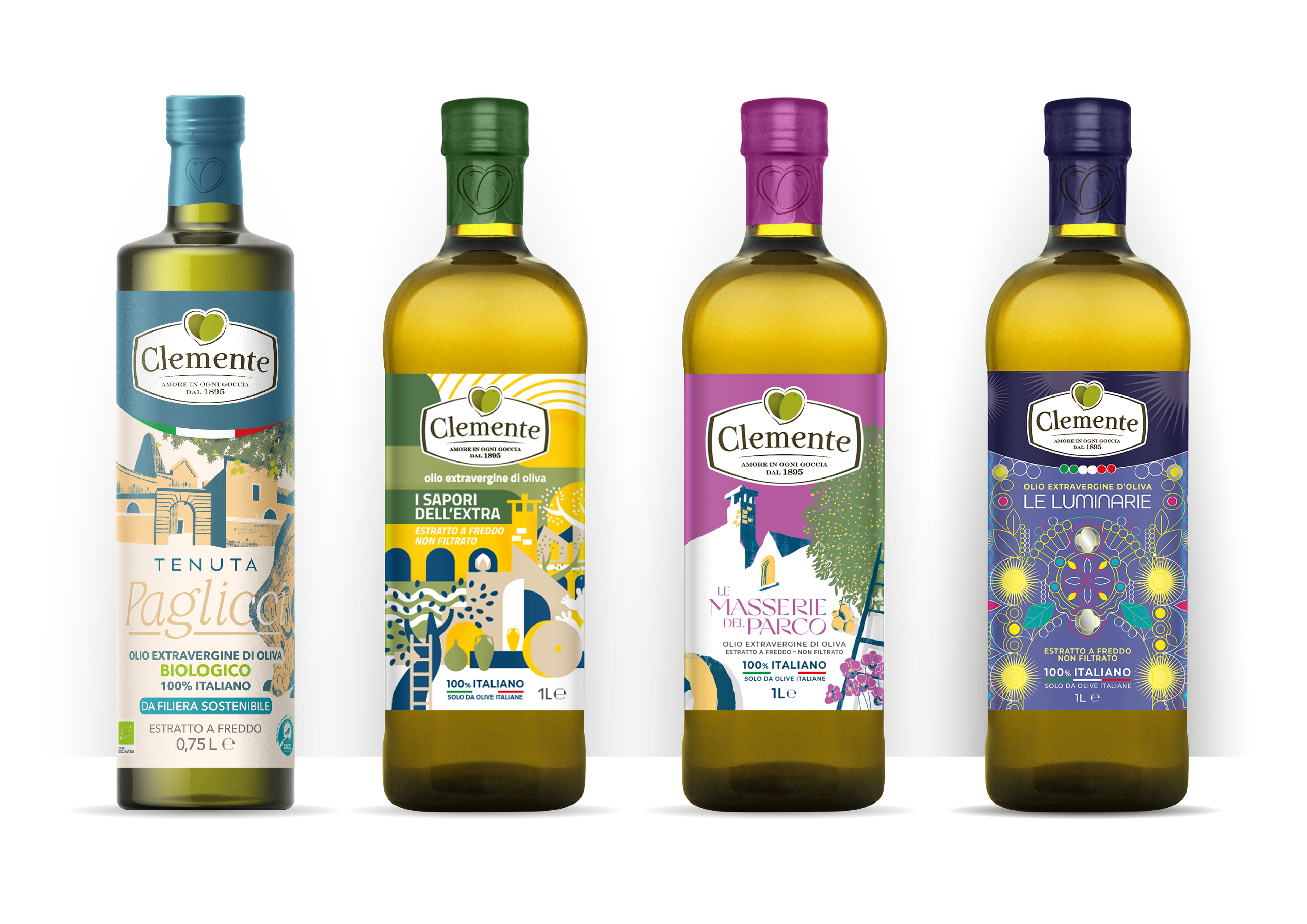
Clemente is an extra-virgin oil producer from Puglia, Italy: each one of its vast range of products draws inspiration from the rich history and culture of this region.
The team of Arc's Design Agency was tasked with developing a new look for each product.
The proposal presented here is a reference to the Luminarie, a Christmas tradition popular in the Salento region where towns display elaborated and colorful light installations in the streets.
The goal of my design was to encapsulate the richness and complexity of the lights while keeping a sense of elegance and order.
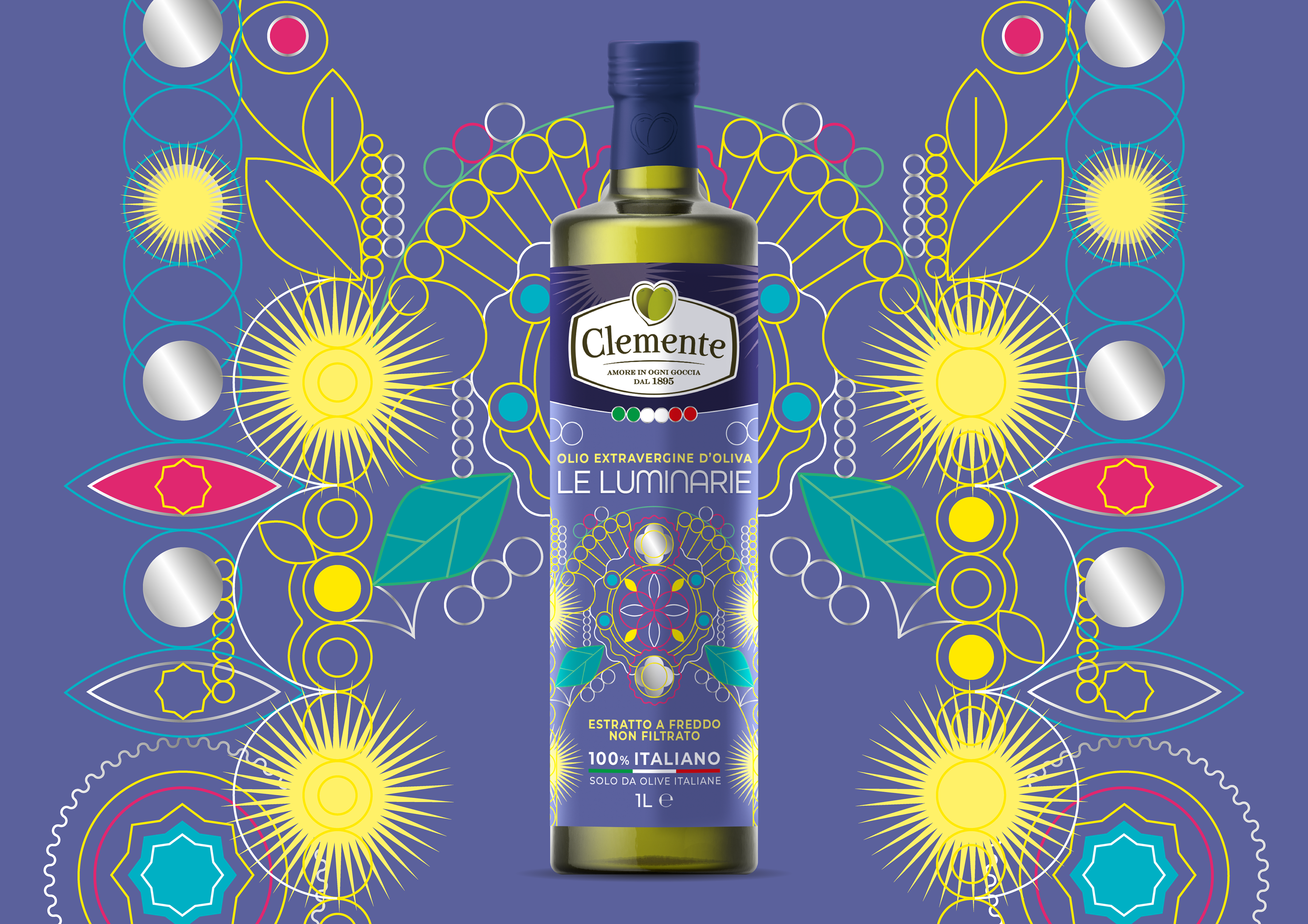
Below you can see the final product besides other examples of restyling from the same product line.
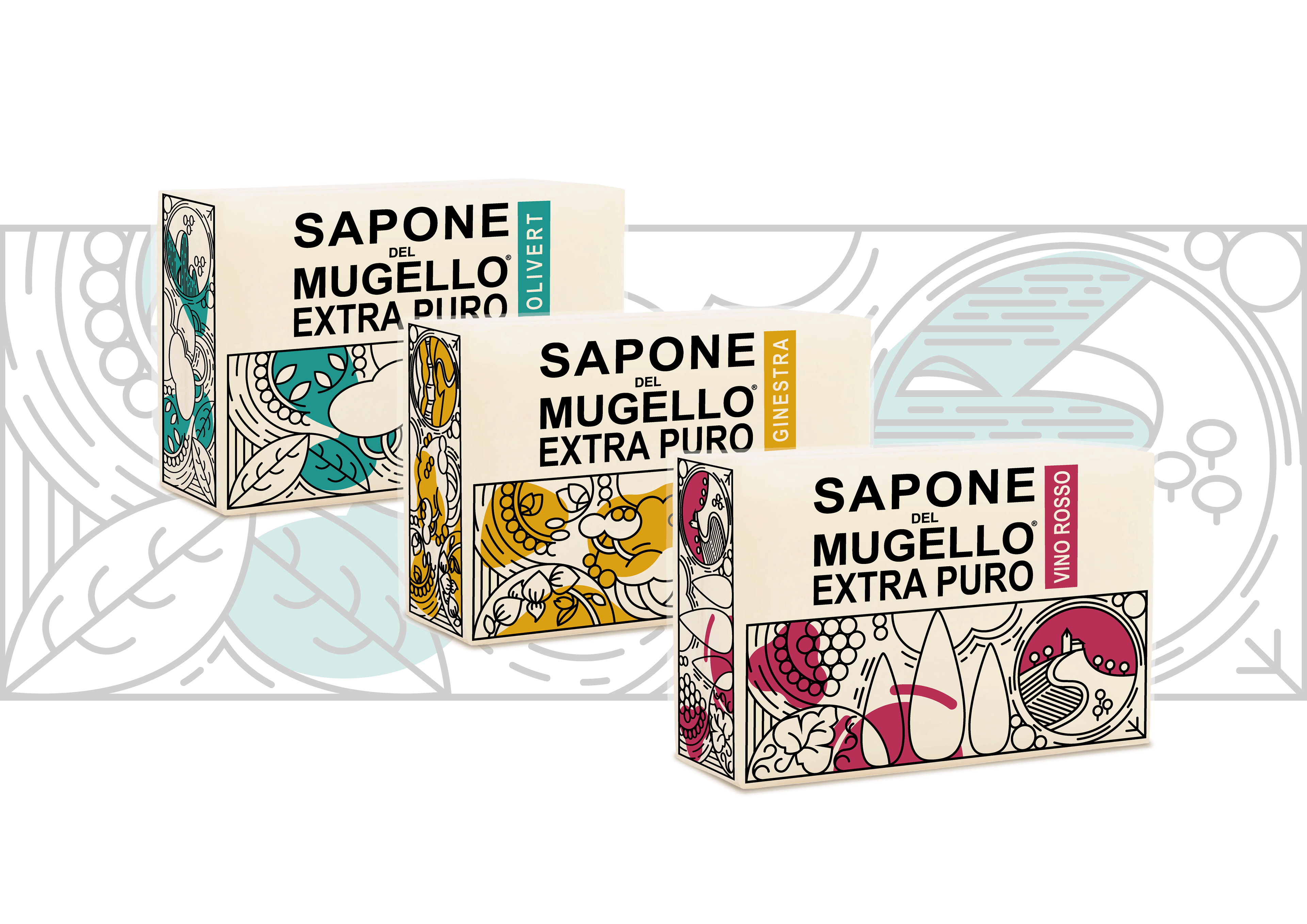
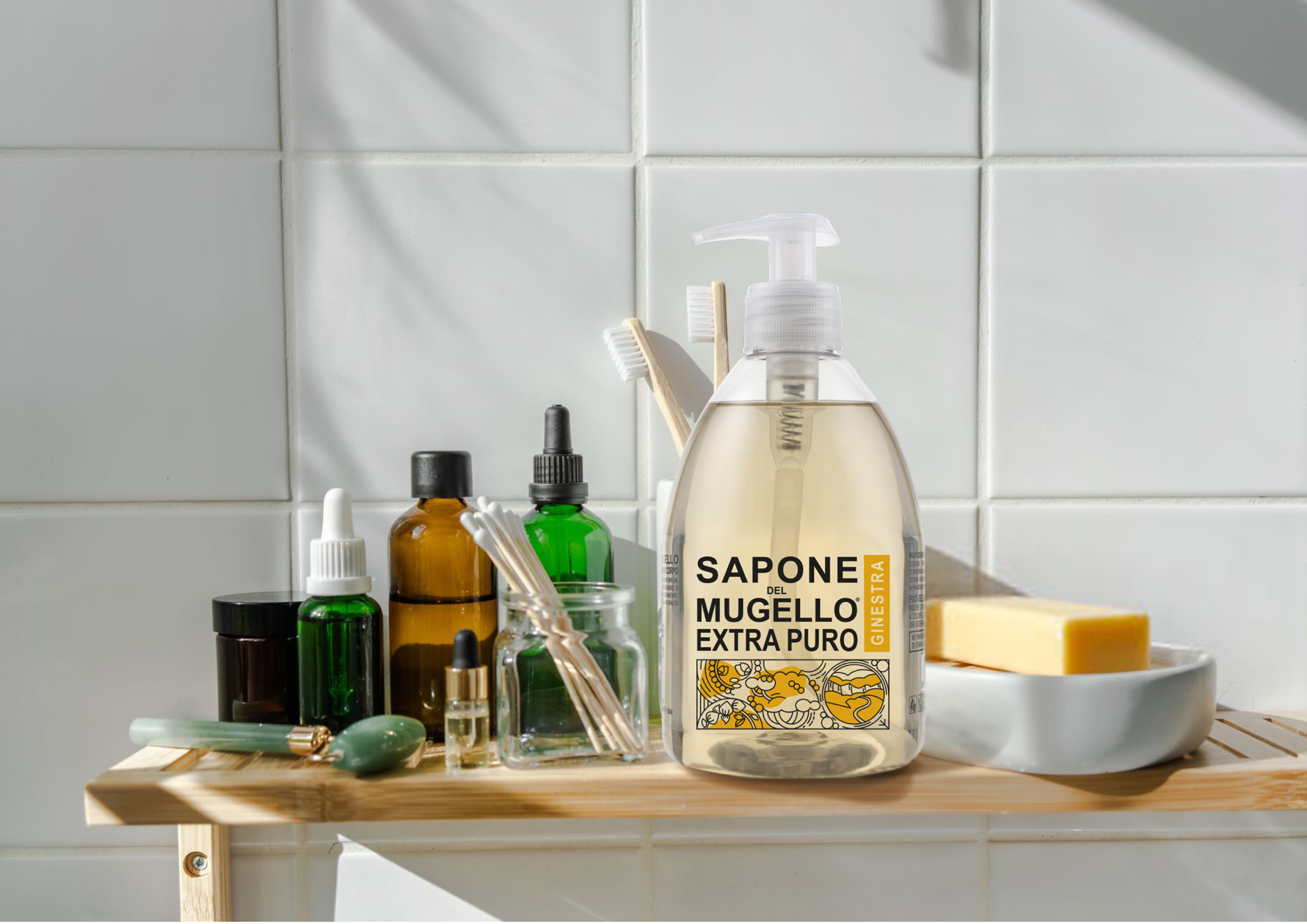
Sapone del Mugello is a brand of personal hygiene products from Tuscany. Although they have expanded far beyond that border, they still maintain a close and proud connection to their origins.
Their new packaging line would launch three soaps inspired by three individual areas in Tuscany, each with its unique landscape, vegetation and feeling.
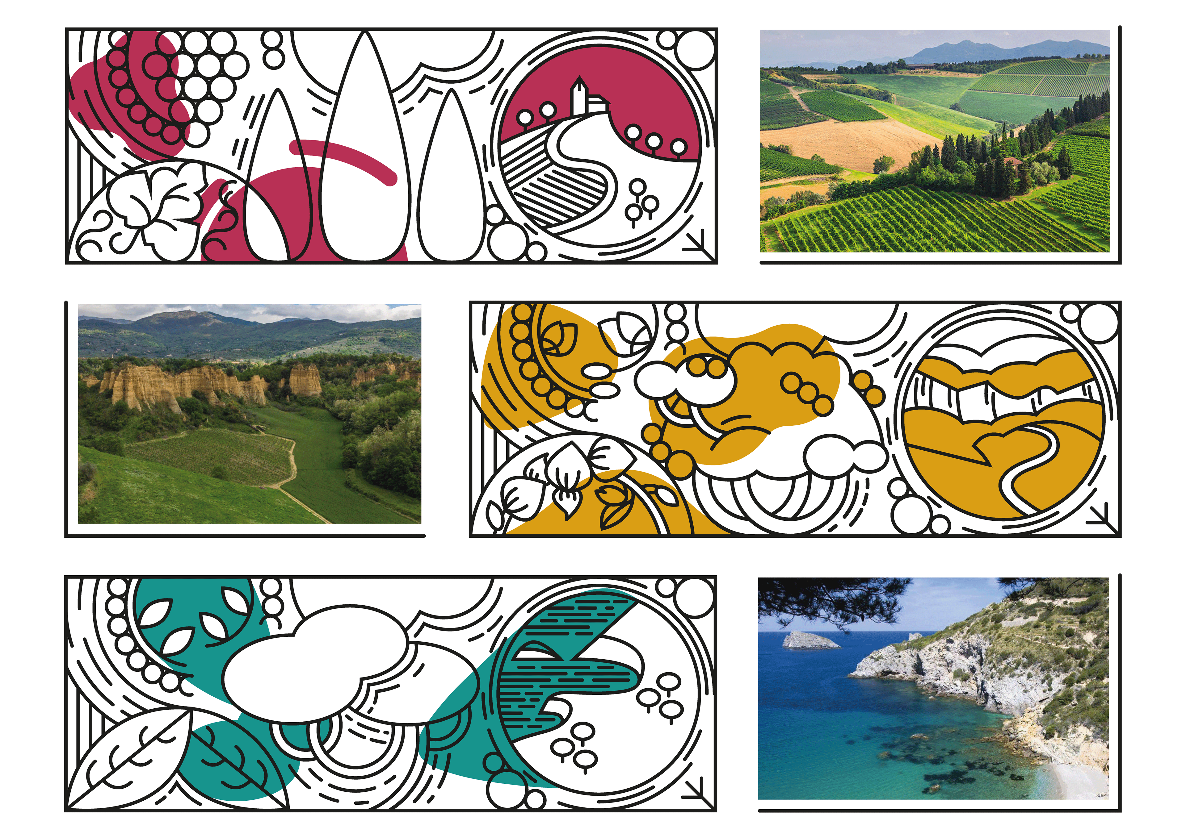
I began by isolating the main features of these settings to create their illustrated counterparts, adjusting each detail to obtain a dynamic but tidy composition that matched the clean aesthetic of the brand.
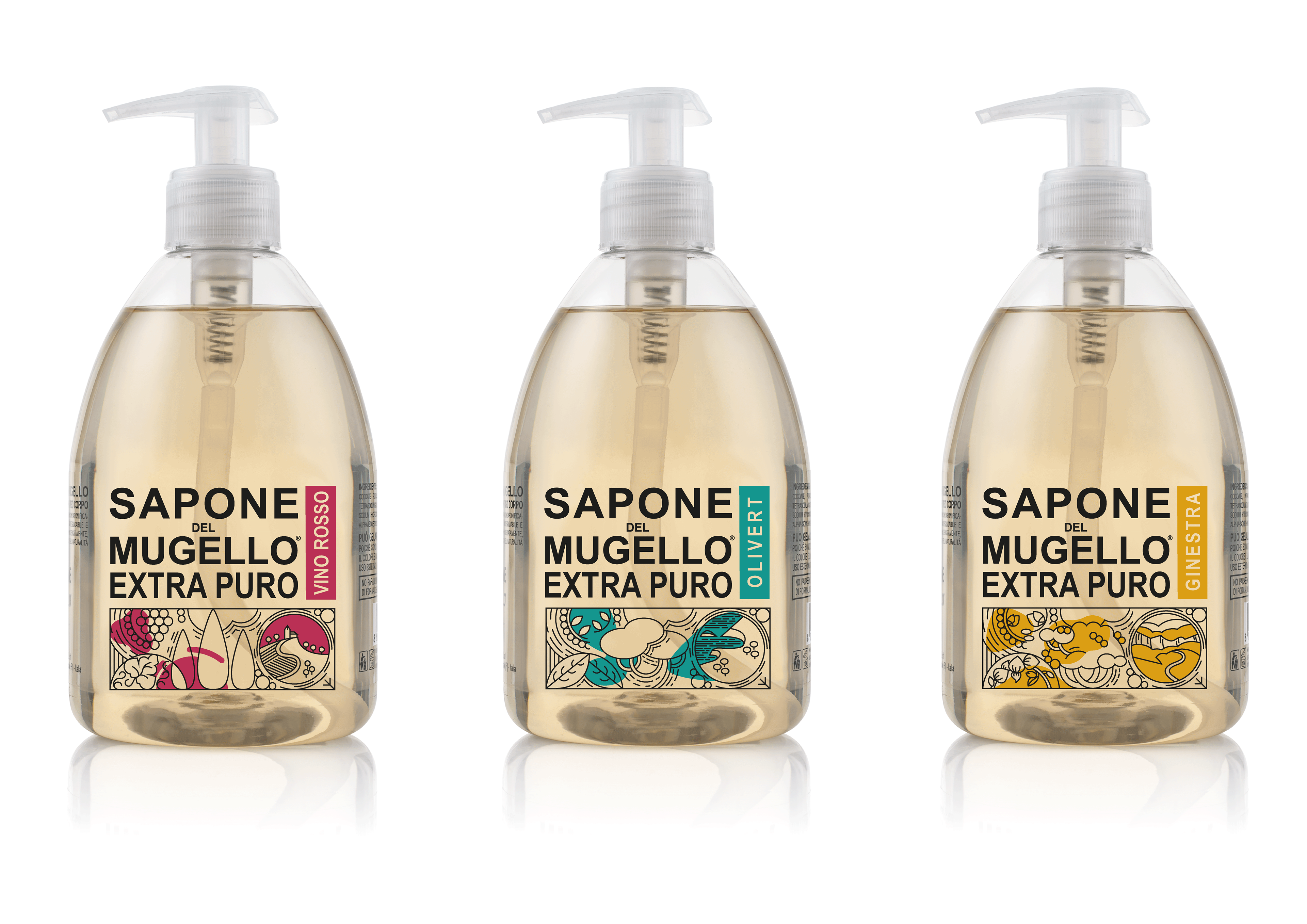
Showcasing the various landscapes in a distinct way without disrupting the harmony of the packaging was the main, and fun challenge.
Projects made with the team of Arc's Design Agency